Shader Components
Shader Button Set
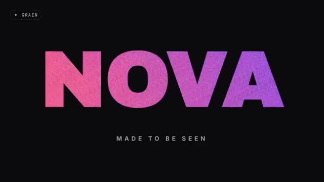
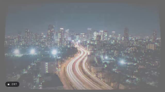
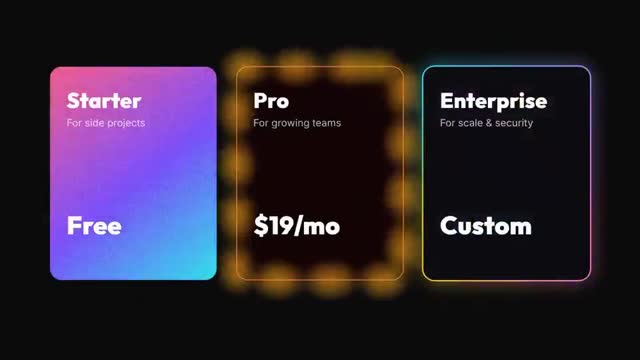
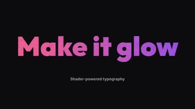
Five call-to-action buttons with living shaders inside — aurora, sweeping beam, frosted glass, flickering ember and liquid chrome pill — each pressed in turn by a cursor. A premium UI showcase for SaaS and apps.
What you can change
- Labels
- Colours
- Transparent overlay
- Category
- Shader Components
- Collection
- Backgrounds & Generative
- Length
- 7s
- Shape
- 16:9 landscape
- Photos
- No photos needed
- Format
- Background, Ui demo
- Mood
- Futuristic tech, Corporate clean, Dreamy calm